library(ggplot2)library(dplyr) # without suppressMessages
Attaching package: 'dplyr'
The following objects are masked from 'package:stats':

    filter, lag
The following objects are masked from 'package:base':

    intersect, setdiff, setequal, union
library(tidyr)
If we sample data from a distribution, then a mean of those data is close to the mean/expectation of the distribution.
x <-rbinom(100, 16, 0.1) # expectation is 16 * 0.1 = 1.6mean(x)
[1] 1.54
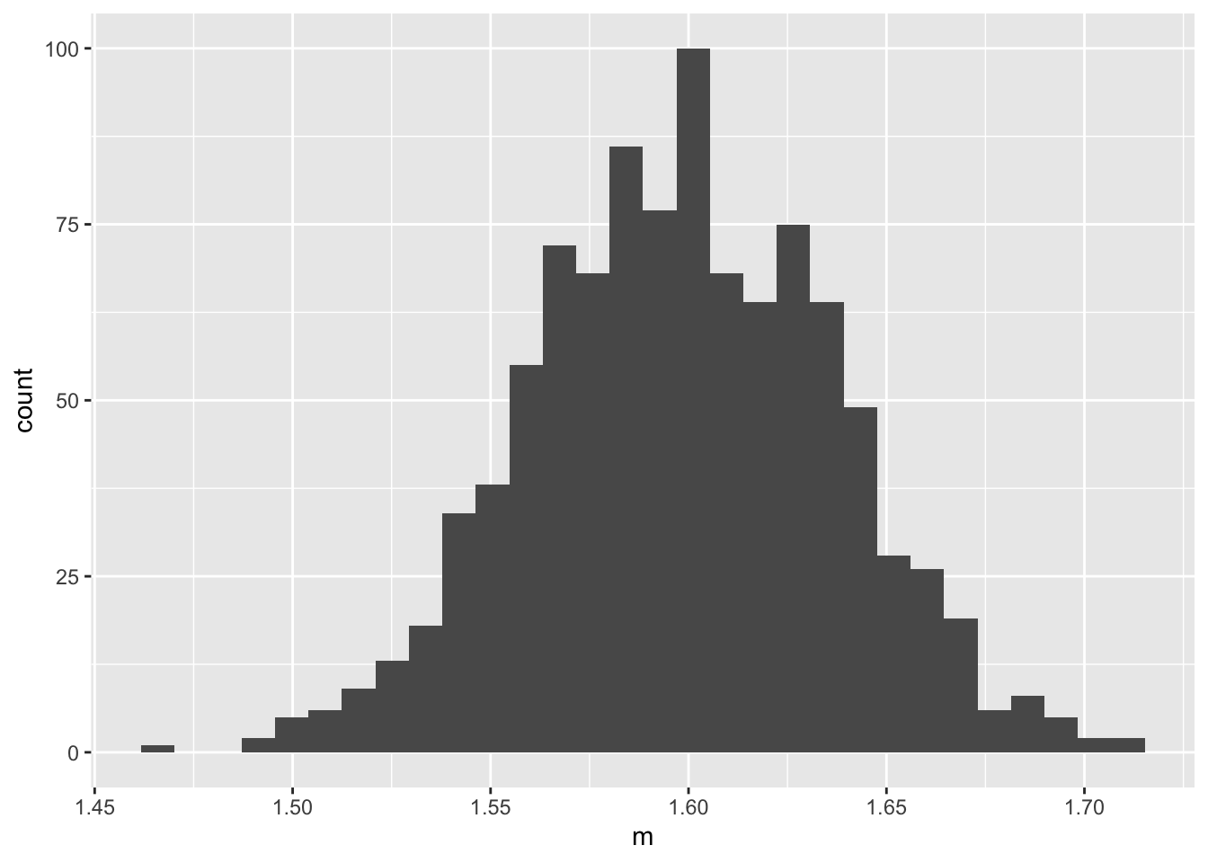
If R of us each take our own sample of the same size, we all get different means. The shape of a histogram of multiple means will (nearly always) be approximately normal.
R <-1000means <-replicate(R, { x <-rbinom(1000, 16, 0.1)mean(x)})df <-data.frame(m = means)ggplot(df, aes(m)) +geom_histogram()
`stat_bin()` using `bins = 30`. Pick better value `binwidth`.
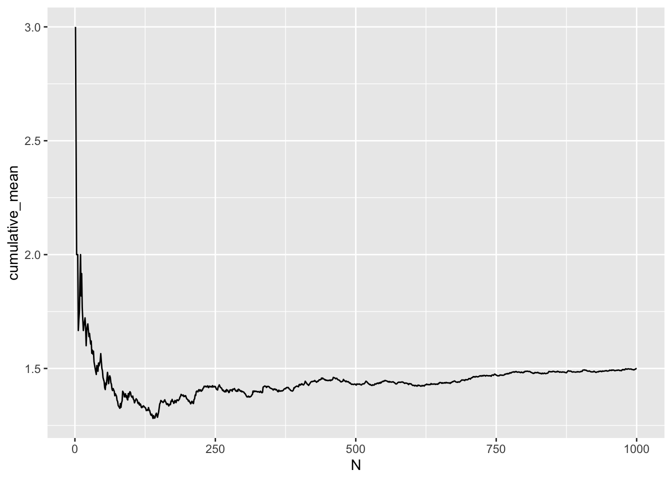
Now consider more data, instead of multiple means. With more data, we naturally expect our means (of data) to be closer to the mean/expectation of the distribution that generated the data.
The only issue with this convergence is that the convergence is not monotonic. Sometimes with a limited number of data we can be very close to the truth. The problem is, in the real world, we never know the truth. Other times, we can be far from the truth. Again, we never know.
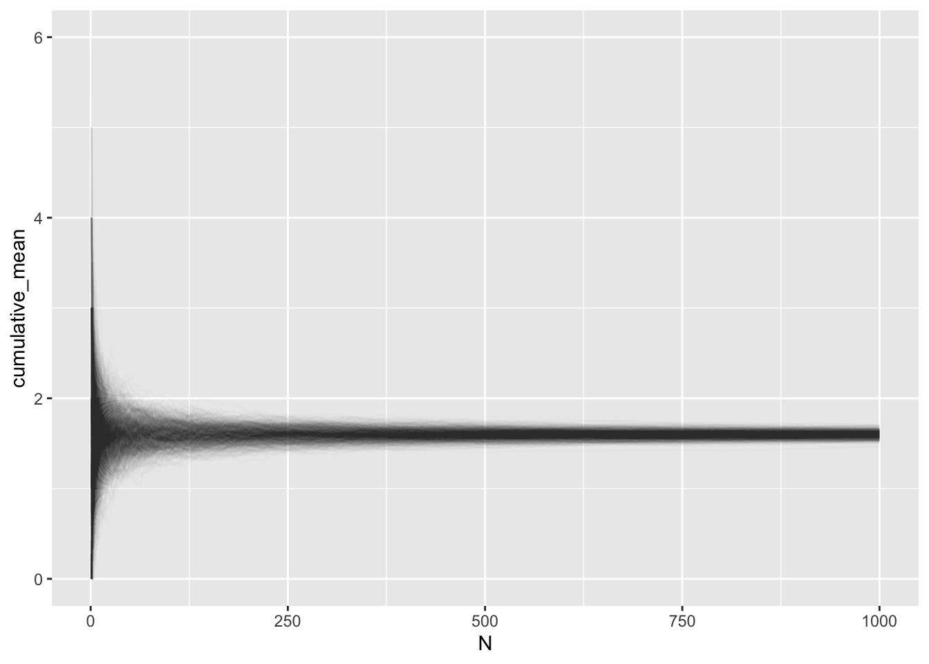
Next, we merge these two ideas together: more data (convergence to the truth) and multiple means (shape of means is approximately normal).
# multiple meansdata <-replicate(R, { x <-rbinom(1000, 16, 0.1)cumsum(x) / N # each one of which converges})# format data for plottingdf <- data %>% as.data.frame %>%mutate(N =1:1000) %>%pivot_longer( # wide -> long/tall data framescols =!N,names_to ="ID",values_to ="cumulative_mean" )ggplot(df, aes(N, cumulative_mean, group = ID)) +geom_line(alpha =0.01) +guides(color ="none")
The histogram above is as if we took a vertical slice of the data at N = 1000, flipped is horizontally, and made a histogram of it.
Source Code
---title: "Central Limit Theorem"author: "Edward"format: htmleditor: visual---```{r}library(ggplot2)library(dplyr) # without suppressMessageslibrary(tidyr)```If we sample data from a distribution, then a mean of those data is close to the mean/expectation of the distribution.```{r}x <-rbinom(100, 16, 0.1) # expectation is 16 * 0.1 = 1.6mean(x)```If `R` of us each take our own sample of the same size, we all get different means. The shape of a histogram of multiple means will (nearly always) be approximately normal.```{r}R <-1000means <-replicate(R, { x <-rbinom(1000, 16, 0.1)mean(x)})df <-data.frame(m = means)ggplot(df, aes(m)) +geom_histogram()```Now consider more data, instead of multiple means. With more data, we naturally expect our means (of data) to be closer to the mean/expectation of the distribution that generated the data.```{r}x <-rbinom(1000, 16, 0.1)N <-1:1000cm <-cumsum(x) / Ndf <-data.frame(cumulative_mean = cm,N = N)ggplot(df, aes(N, cumulative_mean)) +geom_line()```The only issue with this convergence is that the convergence is not monotonic. Sometimes with a limited number of data we can be very close to the truth. The problem is, in the real world, we never know the truth. Other times, we can be far from the truth. Again, we never know.Next, we merge these two ideas together: more data (convergence to the truth) and multiple means (shape of means is approximately normal).```{r}# multiple meansdata <-replicate(R, { x <-rbinom(1000, 16, 0.1)cumsum(x) / N # each one of which converges})# format data for plottingdf <- data %>% as.data.frame %>%mutate(N =1:1000) %>%pivot_longer( # wide -> long/tall data framescols =!N,names_to ="ID",values_to ="cumulative_mean" )ggplot(df, aes(N, cumulative_mean, group = ID)) +geom_line(alpha =0.01) +guides(color ="none") ```The histogram above is as if we took a vertical slice of the data at `N = 1000`, flipped is horizontally, and made a histogram of it.