MATH 385 Week 09 Worksheet
Please submit one Python file (worksheet09_solutions.ipynb)
by 11:59pm Pacific time on Friday, October 25, in Week 09 to
your Week 09 GitHub repository.
- Import the carnivora into
a dataframe in Python. You can read about the dataset here.
- Use the theme
theme_minimal()throughout this assignment. Further, all plots should have a title, axis labels with appropriate units, and legend where appropriate. - Make a scatter plot using
geom_point()using the numeric variablesSWon the x-axis andSBon the y-axis. Put the both axes on log10 scale. - Make a histogram of the variable
GLwith the y-axis being scaled to density. Specify no fill and a color of your choice. Overlay a density plot. Add a rug plot to your histogram, making transparent the ticks (with thegeom_rug(...)keyword argumentalphawhich takes a number between 0 and 1) so as to better see the density of them. - Describe the shape of the data/distribution in the histogram above. Your answer should include both the quantity of modes and the type of skew.
- Referencing the histogram above, use Python code to identify
the
Familyof the animal with an extreme gestation length. - Make a violin plot with box plots overlayed and narrowed so as to fit within the violin plots. You choose appropriate variables. Add color to the violin plots, but ensure the box plots are still visible.
- Referencing the box plots above, write two sentences comparing the quantiles of the different groups. One sentence should talk about the medians and one sentence should talk about the variation/width/noise amongst the groups.
- Use the theme
- Import the
temperature
dataset. You can read about this dataset here. Your goal is to re-create the plot below.
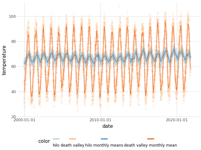
Here are some hints in no particular order.
- Create columns
monthandyearby first using pd.to_datetime() to change the type ofdatetodatetime64. Then extract months and years using e.g. pandas.Series.dt.month properties. - plotnine wants long/tall data, not wide data (like
we have). Use the Pandas function
melt to transform the data from wide to long/tall:
the identifier variable is
month, the value variables arehiloanddeath_valley. Choose variable and value names that make sense to you. - Use geom_jitter(..., alpha = 0.1, width = 0.01) instead of
geom_point()to add just a little bit of x-axis noise to the data, to better see the trends, and reduce the transparency of the points. - It helps to make two dataframes for this one plot, one dataframe using the original data of temperatures and one dataframe of means within each years' months.
- In both dataframes, I made a column named
colorwhich had specific color themes for each location, Hilo and Death Valley. Hilo is in shades of blue, with the means less transparent and darker. Death Valley is in shades of orange, with means less transparent and darker. The specific colors are in the code below, which I used to override plotnine's default color choices with the colors specified in my columnscolor.pn.scale_color_identity(guide = pn.guide_legend(position = "bottom"), labels = {"#3182bd": "hilo monthly means", "#e6550d": "death valley monthly mean", "#fdae6b": "death valley", "#9ecae1": "hilo"})
- Create columns